
Biography
| 1960 | born in Warburg, Germany |
| 1983 – 89 | Studies at the Kunstakademie Düsseldorf (Arts Academy of the city of Düsseldorf) |
| 1989 | Meisterschüler (Master Student) |
| Michael Growe works and lives in Cologne, Shanghai and at the Raketenstation Hombroich. |
Teaching Experiences
School of Fine Arts, Henan Normal University, China: Colour. Space. Interaction. Perception
Shanghai Academy of Fine Arts, China: Body of Colour
University of Cologne, Germany – Faculty of Human Sciences: Courses about visual perception, drawing after nature
University of Music, Basel Switzerland: Project – work about visual perception: to separate a visual conception from language
Basel School for Design, Switzerland: Project-work: how to develop an artist’s point of view
Friedrich-Wilhelm-Secondary School, Cologne, Germany: Art teacher
China Central Academy of Arts, Beijing, China: Project-work: print – workshop
Other Involvements
Senior Adviser of Foundation Insel Hombroich, Germany.
Stage-set designer for the play “Wir“ by Christoph Staude, Biennale Munich for Music-theatre 2006
Works in public collections
Aachen, Museum in der ehemaligen Reichsabtei Kornelimünster
Düsseldorf, Museum Kunstpalast
Frankfurt, Deutsche Bank
Frankfurt, KFWBankengruppe
Kaiserslautern, Museum Pfalz-Galerie
Kleve, Museum Kurhaus
Köln, Museum für angewandte Kunst
Köln, Bankhaus Oppenheim
Köln, Stadtsparkasse
Krefeld, DeutschesTextilmuseum
Krefeld, Volksbank
Mülheim an der Ruhr, Kunstmuseum
München, Bayrische Hypo-Bank
Neuss, Museum Insel Hombroich
Shanghai, Museum of Academy of Fine Arts, Shanghai University
Exhibitions (Selection)
| 2022-2024 | „Sputnik- DSCH“ Bühnen-Projektionen für eine Konzertreihe an 12 Abenden im Museum MAAK, Köln, Germany |
| 2022 | „Michael Growe’s China Shangri-La“ , Shenyang, China (E) |
| 2022 | „Wolpertinger“ , Krefeld, Germany (E) |
| 2022 | „Paris Print Fair“ at Emanuel von Baeyer Cabinet, Paris, France (G) |
| 2022 | „Paare in der Kunst“, Düsseldorf, Germany (G) |
| 2021-2022 | „Finale-Directors Cut“, Museum Pfalz-Galerie, Kaiserslautern, Germany (G) |
| 2020 | „Dear Deer“, Deer and All Art Space, Shenyang, China (E) |
| 2019 | „Painting Bodies“, Pushan Art Gallery, Shenyang, China (E) |
| 2018 | „Bilder ohne Schatten“, Museum Kunstpalast, Düsseldorf, Germany (G) |
| 2017 | „Parallele Holz“, formformsuche, Köln, Germany (G) |
| „Beware of the Greek“, Kunstverein Krefeld, Germany (G) | |
| „Farben Werden“, Pushan Art Gallery, Shenyang, China (E) | |
| „Petersburger“ Riss, Samedan, Schweiz (G) | |
| „Open Eyes = Open Mind“, Shibukawa, Japan (G) | |
| 2016 | „Up To Seven“ formformsuche, Köln, Germany (E) |
| „FUGUE“ (mit Ingvar Staffans) Uppsala, Sveden 201 (E) | |
| 2015 | „Open Eyes = Open Mind IV“ Minami, Maebashi, Japan (G) / |
| „Gaze“ Main Exhibition Hall, Academy of Fine Arts, Shanghai University, China (E) | |
| „Zwischen Farbe und Form – Sammlung Bongartz“, Deutsche Bundesbank, Düsseldorf, Germany (G) | |
| „Möbel in Mimikry“ gkg, Bonn, Germany (G) | |
| 2014 | „Itinerar“, Concept Space, Shibukawa, Gunma, Japan (E) |
| „Die Sache des Blicks“, Gallery art 203, Shanghai, China (E) | |
| 2013 | „Aufbruch“ Kunsthalle Rostock, Germany (G) |
| 2012 | „Aufbruch“, Museum Kunstspeicher, Würzburg, Germany (G) |
| „Ganz klar das Echo“ Hebel 121 Basel, Schweiz (E) | |
| „Rembrandt ruft“ Villa Goecke, Krefeld, Germany (G) | |
| 2011 | „Pym´s Desk“, Sprungtutm, Köln, Germany (E) |
| „Neue Farben“ Museum Kunstpalast, Düsseldorf, Germany (G) | |
| „Aufbruch“, Situation Kunst, Bochum, Germany (G) | |
| 2010 | „Trojaner“ Studio Burat, Köln, Germany (E) |
| 2009 | „Augenlied“ (E), Galerie Carla Reul, Bonn, Germany |
| 2008 | “Academie d`Ete de la Couleur Soie de Taulignan”, France |
| “New paintings”, Refined Nest Gallery, Shanghai, China, zusammen mit Chen Ruo Bing and Chen Qiang (G) | |
| „Aufatmen“, Gallery Imoberdorf, Murten, Switzerland (E) | |
| „Academie d`Ete de la Couleur Soie de Taulignan”, Taulignan, Frankreich (G) | |
| „Schwarzeis“, Galerie Imoberdorf, Murten Schweiz (E) | |
| 2007 | „Approach“, Cube Gallery, Beijing, China (G) |
| „Woche im Regal“, Villa Goecke, Ralph Kleinsimlinghaus, Krefeld, Germany (E) | |
| „Cadavre Exquise“, bei Hoeps, Münster, Germany (E) | |
| 2006 | Bühnenbild für das Musiktheater „WIR“ von Christoph Staude nach Samjatin im Rahmen der 10. Biennale „Internationales Festival für neues Musiktheater in München“, Germany |
| 2005 | „mobilis in mobili“ Galerie Barbara Cramer, Bonn, Germany (E) |
| „mobilis in mobili“ Galerie Riss, Samedan, Schweiz (E) | |
| Künstlerhaus Dortmund, Germany (G) | |
| „KetteSchuss“ Fahnen für das Deutsche Textilmuseum Krefeld, Germany | |
| Beijing International Art Biennale, China (G) | |
| 2004 | „Raumschiffe“, (mit Martin Streit) im Kunstverein Unna, Germany |
| Galerie Imoberdorf, Murten, Schweiz (E) | |
| Kunsthandel Kleinsimlinghaus, Krefeld/Düsseldorf, Germany (E) | |
| „Farben der Insel“, Städtische Galerie Viersen, Germany | |
| 2003 | Kunstpreis Münsterland mit Ausstellung im Kunstverein, Germany |
| 2002 | „Zikkurat“, Pfalzgalerie Kaiserslautern, Germany (E) |
| Stadtmuseum Beckum, Germany (E) | |
| Museum der Stadt Ratingen, Germany (E) | |
| „space oddity“, Galerie Imoberdorf, Murten, Schweiz (E) | |
| „Rain“, Galerie Barbara Cramer, Bonn, Germany (E) | |
| Kunst am Bau: JVA Rohrbach/ Rheinlandpfalz: Vier Bilder, Germany | |
| 2001 | „Die Sammlung Kemp“, Städtische Kunsthalle Düsseldorf, Germany |
| Kaunas, Litauen (G) | |
| „Zikkurat“, Kunstverein Münsterland, Coesfeld, Germany (E) | |
| 2000 | „Schachtelkunst“, Museum Alte Post, Mülheim/Ruhr, Germany (G) |
| Augenweide Wolkensteno, Schlanders, Italien (E) | |
| 1999 | „Sammlung“, Museum Alte Post, Mülheim/Ruhr, Germany |
| 1998 | „Sieben Sachen“, Museum für angewandte Kunst, Köln, Germany |
| Fahnen für das Museum, Kunstverein Braunschweig (mit Andres Bally) | |
| 1995 | „Unter Freunden“, Galerie Rasche, Münster (mit Frank Herzog) |
| „Uferbänder“, Kunsthaus Rhenania Köln (mit Andres Bally) | |
| 1994 | „Wir hier“, Kunsthalle Recklinghausen (G) |
| 1992 | „rebis“, Haus Koekkoek, Kleve (E) |
| 1991 | Städtische Kunsthalle Düsseldorf |
| 1988 | Galerie Januar, Bochum (E) |
Partnership/ Cooperation
Dirk Gebhardt IT
Markus Kaufmann carpenter
Stephan Kitschen carpenter
Christoph Leistenschneider consultant, carpenter
Oktay Osmanov CAM
Peters, Glas und Räume glas painting
Ralph Taubenreuter chassis
Gerd Türke IT
Tamara Soliz IT
Edward Schizle Airbrush
Wolfgang Burat photography
Regina Hügli photography
Alistair Overbruck photography
Octavia Schoplick photography
Baimei Zheng photography
Bibliography
Wolpertinger
Werkverzeichnis
Text: Bettina Haiss
Fotografie: Alistair Overbruck
und
Esmin Dili
Johannes Growe
Sinan Mece
Barbara Streil


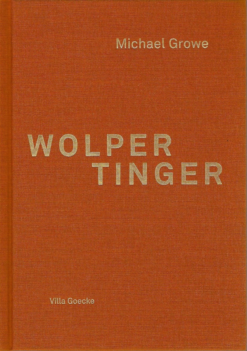
Wolpertinger –
oder die unverhohlene Leichtigkeit des Scheins
Am Anfang war das kreative Chaos. Ein ungeordnetes Sammelsurium aus Fundstücken, unliebsamen Erbstücken, überflüssigen Geschenken, kuriosen Artikeln, demontierten und demolierten Frühwerken, kurzum, ein dichtes Durcheinander von bunt zusammengewürfeltem Material versammelt sich im Atelier. In einem solch reichhaltigen Fundus an objets trouvés trifft zwangsläufig aufeinander, was nicht zusammen gehört. Und so entstehen als ungezwungene Kompilationen seit 2004 bis heute die Wolpertinger.
(…) die Wolpertinger präsentieren sich als bisweilen bizarre Bricolagen, verbinden sie doch beispielsweise einen Motorradspiegel und das von der ungelenken Hand eines Amateurs ausgeführte Damenportrait in Öl (Eifel, 2012). An anderer Stelle werden ein Sesselbein, eine Kokosnuss-Schale und ein altes Spielzeugrad miteinander vereint. (Predator, 2013).
Das Erscheinungsbild eines jeden Wolpertingers konterkariert das klassisch bildhauerische Ideal einer harmonisch ausbalancierten Einheit. Hier werden die einzelnen Elemente nicht in exakter Präzisionsarbeit zusammengeführt und zugunsten der Vortäuschung einer übergeordneten geschlossenen Gestalt kaschiert. Die Verschränkung von Finden und Erfinden, die ihrer Entstehung zugrunde liegt, lässt brüchige Übergänge, Asymmetrien, Schieflagen zu, stellt das Improvisierte, Imperfekte heraus.
Die Wolpertinger behaupten sich selbstbewusst als »Mischwesen«. Ihre fragmentarische Körperlichkeit bildet multiple Facetten ihres Urhebers ab. Denn die disparaten,in einen bisweilen ungelenken Zusammenhang überführten Dinge sind angefüllt mit Spuren, Erinnerungen, Eindrücken, mit Rückständen von partikularen Interessensgebieten: Allesamt Ausschnitte einer Individuellen Mythologie, sind einzelne ihrer Elemente mit verschlüsselten persönlichen Geschichten behaftet (…) Indirekt oder direkt verweisen sie
auf Literatur, Kunstgeschichte, Naturwissenschaft, Popkultur, aber eben auch auf die eigene Biografie. Symbolhaft verdichtet, ergeben die vielfachen Rekombinationen und die in ihnen angelegten Bezüge und Referenzen eine Art »Kryptobiografie«. Entsprechend und in Erweiterung der bruchstückhaften Natur der Wolpertinger, die als eigenwillige Assemblagen hervorgehen, ist auch bei der Gestaltung dieses Buches eine undogmatische kombinatorische Praxis am Werk. In enger Korrespondenz zum Entstehungsprinzip der dreidimensionalen Objekte wird auch der zweidimensionale Raum zum Spielplatz für die schöpferische Verwertung von verschiedenartigem Bildmaterial. Die Bilder in dieser Publikation bestehen aus vielschichtigen Collagen und zeigt sich somit heterogen wie die Objekte, die es in sich aufnimmt.
Die verarbeiteten Vorlagen spiegeln private Gedanken und Vorlieben wider, gewähren punktuelle, teils ironische Einblicke in die subjektive Prägung der Künstler-Persönlichkeit. In diesem versteckten Selbst-Portrait, welches das Leben selbst als üppige Sammlung an Erfahrungen und Eindrücken auffasst
und die Fülle der Existenz im Spiel feiert, verschmelzen
Stoffe aus jugendlichen Träumen und Abenteuerwelten mit China-Impressionen; fiktive Sci-Fi-Visionen, historische Forschungsexpeditionen und eigene Motorradtouren verbinden und verwandeln sich. Der künstlerische Kosmos von Michael Growe umfasst Klitterung und Karikatur, Mondfahrt und Kaffeefahrt. Wie traditionelle Wunderkammern offenbaren diese vielseitig angelegten Bildfindungen dem Betrachter neue, der Auswahl des Künstler-Sammlers entstammende Bild-Welten. In diesem Buch entfaltet sich ein ganzes Panoptikum: Manga- Zeichnungen von Katsuhiro Otomo und die Apokalyptischen Reiter von Albrecht Dürer treten auf, ebenso finden historische Mondkarten, Hitchcock-Filme und Tintin-Comics Eingang. Der Betrachter wird eingeladen, analog zu den vielfältigen Spielarten der Wolpertinger, den eigenen Bildungshorizont zu erweitern, Ideen wie Irrfahrten zu folgen, sich mit eigener Vorstellungskraft auf die paradoxen Objekte einzulassen und auf eine unbestimmte Reise zu begeben.
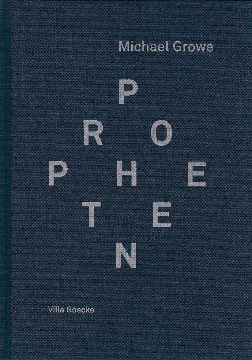
Propheten
Text: Bettina Haiss
Fotografie: Wolfgang Burat
Beratung: Mathilde Niehaus
IT / Übersetzung: Baimei Zheng


Das Bild vom Bild
Zu den Propheten-Bildnissen von Michael Growe
(…)
Um es einmal vorweg zu nehmen: Michael Growe malt
Bilder von Bildern von Gesichtern. Die zwischen 2012 und
2013 entstandene Werkgruppe Propheten besteht aus 18 schwarz-weiß Gemälden im kleinen Format (40 × 24,5 cm).
Als bildfüllende und nahezu lebensgroße Kopfbildnisse,
das Gesicht in frontaler Ansicht oder in seitlicher Neigung präsentiert, bilden sie eine Ausnahme innerhalb des Gesamtwerks des Malers, welches sich unter Umgehung figürlicher Darstellung hauptsächlich derauf die eingehende Erforschung von Malerei hinsichtlich ihrer Räumlichkeit, Materialität und Körperlichkeit konzentriert. Diese geschlossene Gemäldereihe wird immer als durchgehender Block präsentiert, wodurch ihre dichte motivische Ansammlung den Eindruck einer physiognomischen Musterschau erweckt.
Und tatsächlich liegen Growes 18 Gemälden Fotografien
von Julius Weitmann aus den 1960er Jahren zugrunde, die als Illustrationen dem »wissenschaftlich« aufbereiteten Bildband “Das Gesicht des seelisch Kranken” (1967) von Professor Dr. med. Dr. phil. Gerhart Mall beigegeben sind. Seine Publikation sollte als allgemein verständlicher Leitfaden für »den Arzt, […] aber auch den Anthropologen, Soziologen und Juristen, dem Seelsorger«
in die »patho-physiognomische Antlitzkunde« einführen. Wie aus der Einleitung des Verfassers – der während der NS-Zeitals Parteimitglied und Anhänger der propagierten Ideologie die Tötung seines psychisch erkrankten Bruders systematisch vorantrieb und nach dem Krieg als leitender Psychiater tätig war – hervorgeht, habe Weitmann anhand von »künstlerisch hervorragenden« Aufnahmen von Patienten der Pfälzischen Nervenklinik Landeck eine umfassende »Bilddokumentation des Gesichtsausdrucks des seelisch Kranken« geschaffen.
(…)
Growes eigenständige Abwandlung des Originals ist ein Angriff auf die vernichtende Funktion der Krankheitsbilder. Die vormalig einseitig besetzte Physiognomie der Portraitierten tritt zugunsten der physischen Materialität der gemalten Oberfläche ihrer Bildnisse zurück. Seine bildkritische Sichtweise veranlasst ihn, die übernommene Bildvorlage durch Malerei zu verfremden und das in den Portraits vermittelte »Wissen« durch die Einführung neuer disruptiver Bildinhalte zu beeinträchtigen. Während die heikle Realität der Bildnisse zurückweicht, wird der Betrachter mit der Realität des Bildes an sich konfrontiert.
(…)
Obgleich also eine Ähnlichkeit zwischen den
Illustrationen von Weitmann und den Propheten gegeben
ist, geht die Bildaussage über die Wiedergabe des bloßen Darstellungsgegenstands hinaus. Vielmehr dient die gewählte Abbildhaftigkeit in der Veranschaulichung der Portraitierten dem Künstler als (technischer) Vorwand zur Illustration der variablen Methoden der Vorführung im Bild. (…)
Zum entscheidenden Bildthema Growes wird nun der Darstellungs- und Visualisierungscharakter der Bildnisse,
ihre Eigenschaft als Bild, ihr offengelegter »Status des BILD- SEINS […],
(…) Nicht die dargestellten Personen, sondern die Inszenierung und Ins-Bild-Setzung ihrer Andersartigkeit hat hier ihren Auftritt. In Entsprechung der von Weitmann Portraitierten, die eine ihnen zugewiesene Rolle aufführen und mit ihrem (inszenierten) Erscheinungsbild eine an sie herangetragene Erwartungshaltung erfüllen, führt Growe seine Propheten als Maskerade vor: Sie treten dem Betrachter in ihrem nackten Bild-Sein als leere Maske, als stets neu zu bespielende Projektions-fläche vor Augen. Letztlich malt Growe ein »Bild vom Bild« in seiner ganzen Störanfälligkeit – und erkennt dabei selbstreflektierend an, dass es sich bei jeder künstlerischen Verbildlichung eines Sujets um die Verkörperung eines zugrunde-liegenden Konzepts und damit Projektion des souveränen Blicks des Künstlers handelt.
Es sind diese mit Wertvorstellungen und den sich zwangsläufig aus ihnen ergebenden Vorurteilen behafteten, zu Klischees erstarrten Bilder, die Growe einer gründlichen Umwertung unterzieht. Ist das Bild des Anderen eine Konstruktion, so lässt Growe ausgehend von seiner Dekonstruktion eine alternative Sichtweise aufscheinen. Er betreibt die Abkehr von der Eindeutigkeit der Festlegung, der Endgültigkeit der Fixierung, gleichsam die Abwendung vom »Auge, das weiß und entscheidet; das Auge, das regiert.« (Michel Foucault)
Auch Growes Aneignung der Portraits ist ein Akt der Bemächtigung, geschieht jedoch unter anderen Vorzeichen. In diesem Zusammenhang erscheint auch der Titel der Portrait- Reihe als inhaltliche Umwertung bzw. Neubesetzung. Propheten bezeichnet die berufenen Verkündiger von Gottes Botschaft. Durch die Umbenennung der »seelisch Kranken« wird die eindeutige Sichtweise auf ihr Erscheinungsbild relativiert. Aus den Gezeichneten werden Gesandte. Mittels einer derartigen Überhöhung der Portraitierten zeichnet Growe ein »anderes Bild«.
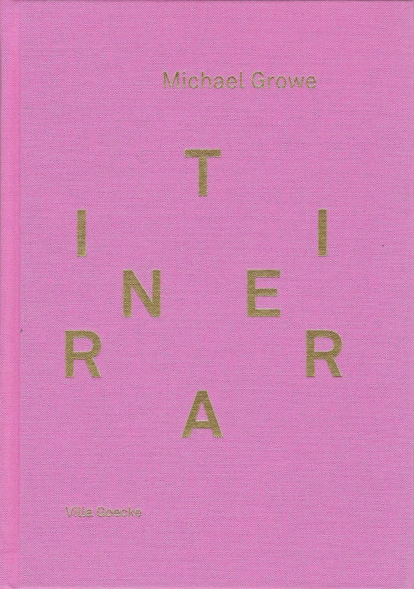
Itinerar
Text: Zhu Ting
Photos: Alistair Overbruck
Photos landscapes: Michael Growe
…In the Itinerar we look at straightforward yet dramatic patterns/shapes. The composition is always straightforward – just like the “black square”: polygon, circle, cross, star, cloud … These simple shapes undoubtedly trigger reflexes that resemble recognition. Their colours turn out to be complex in contrast to the simplicity of the forms. With these game-like patterns of blue and yellow, red and green, orange and grey, purple and grey, dark reddish purple, and dark red, emotions are strongly conveyed.

Trojaner
Text: Bettina Deschler
Fotos: Wolfgang Burat
ISBN 2563789852-3
The cabinet is a painting
… Based on minimalist discourses, in Michael Growe’s work the painting goes through the transformation not only from fiction to facticity, but further into functionality. The movable, three-dimensional parts of a cabinet such as the doors and drawers, and their characteristic incisions in the surface leave their mark in Growe’s holistic painterly conception of the object. His painting takes up these constructive divisions of the object and pushes them further, transforming them into pure shaping and forming, as a graphic over-all principle that covers the entire body evenly like a skin made up of chromatic patches.
The decentralization of the painterly surface achieved by the all-over technique, as it was practised in abstract expressionism and minimalism, is now applied by Growe to a solid body to hide the functionally prescribed divisions of the piece of furniture in a formally dissolved, non-hierarchical articulation…. The holistic perception of Michael Growe’s paintings requires not only the recognition, but also a turning-away from external, physical space in order to delve into the voluminous chromatic space which the surface reveals to the gaze. Growe conceives of the surface as a transparent window that opens the vista onto an interior, imaginary space. It is a completely abstract space composed of shimmering chromatic valencies that awakens associations with ocean waves, clouds and mountains, those natural phenomena and happenings in the landscape where heavy masses are set into motion, communicating also an impression of the sublime. This allusion to the deeply romantic moment of immersion in an atmospheric phenomenon is at the same time an appeal to the viewer to abstract from the outer surroundings so as to lose oneself in the painting, to allow oneself to be captivated by the painterly masses. Bettina Deschler, Cologne

Catalog for the Exhibition
Text: Erich Franz
Photos: Alistair Overbruck
ISBN: 978-3-941100-3
The Hidden in the Visible
Slowing down – deviation – approximation – something gradual – a -darkening – a glowing – materialization – transparency. Michael Growe’s paintings are in motion; their colored surfaces are not certain but are -developed; they sink into the dark or increase into brightness; they -approximate distinct forms and color values without becoming identical with them or solidifying as impressions. What you see, is not what you see: it develops from something else and also changes towards something else. (…)Though when looking at Michael Growe’s paintings for a longer time, the visible does not become clearer, it becomes more intense. One -discovers a new that which one already saw before, because it becomes -totally different and yet, continues to be that as which one recognized it at first. That which in the beginning perhaps seemed to be simple and easy to grasp, opens up towards something unseen and turns into something new, something different, something unforeseeable – though it also -remains what it appeared to be. (Titles such as Strom or Tanker or -Pessach can suggest the kind of such an emerging of something unseen within the visible, without restricting it to a conceptual content. The -processes in the painting totally remain processes of seeing.) After all, the visible is not limited to the mutual penetration with that which one did not see before. One always remains latently aware of something invisible which will still disclose itself to one’s viewing. That which one, experienced as the unit formed by the one together with the other, continues to retain something undiscovered, something hidden. Erich Franz

Catalog for the Exhibition
Text: Reinhard Hoeps
Photos: Alistair Overbruck, Klaus Weidner, Octavia Schoplick
ISBN: 978-3-941100-17-6
Michael Growe: Woche im Regal
Since 2005, Michael Growe has been advancing the reduction of -picture-geometric complexity in order to strengthen the color values. Here, the coloration is most often strongly subdued, and, in a surprising way, a picture-element, which can be identified as being representational, forces its way into the abstract calculations of color and painted field: the frame – though, of course, not a real frame but a painted one – constitutes part of the paintings surface and, at the same time, the surface’s border. The way the frame is painted comes close to a trompe l’oeil: grains like those of wood, the illusion of relief-like bulges, like a tendency towards an object, and, consequently, shadow zones, even miter joints at the four corners. The painting follows the real frame’s -example, or, more precisely: The process of applying paint and grinding it off leads to structures which are adapted to the grains of wood (or rather: to an emphasizing of the grains by painting the wood and then grinding the paint off again). Growe’s artistic technique enables color-painting to approximate the appearance of wood up to bordering on -indistinctness. Frame and color-painting coincide. The border of the painting is not contrary to the development of color, but arises from it. Color confines itself by surrounding the whole painted field. The representation of shadows emphasizes the self-containment of the painted field as an entity on the wall which is rooted in itself. Painting enables color to assume the functions of painted field and composition, originally contrary to its purpose. In the terse gesture of the enclosing frame, color definitely confirms the painting’s format. In view of this spectacular concept of a transformation of the -picture’s bounds into painting, one might almost miss the picture to be framed: a painting, indeed, but no specific representation. As against the defined borders of the picture, the interior of the painted field remains quite -undefined. With its irregular grain and its play of colors, with its defined articulation in contrast to the free wall, the frame almost seems to tell more than the painted field enclosed by it. Though the marked frame suggests a finestra aperta (Alberti), a window with a view of the world, this window at best looks out on something like a nebulous landscape, and sometimes on something like a curtain. Wherever a certain brushwork can be seen, this gesture appears in a defined rectangle without fixed integration. On the one hand, the picture-surface is -covered by a kind of colored grisaille with indefinite valences in terms of depth, yet without offering one’s view any contours, stops or even fixed structures. On the other hand, the contrast between picture-surface and painted frame is too abrupt for the viewers to enjoy this color-painting in the way they might enjoy a romantic seascape painting. The determinedly painted frame guides one’s view to look for -structuring elements within the painted field, too; there, however, they are missing. A dominating impression is that of a withdrawing void, though a void of extreme density. Responsible for this density on the other hand, is not the intensity of a color, and even less the calculation of a -composition. Instead, the density results from their absence, from a void which is exclusively filled with this precisely indefinite art of -painting. By virtue of this density, the void is of utmost potentiality: at any -moment, shapes and tonal harmonies already existing as germs, might crystallize from this primeval mud. Yet, this imagination probably just tries in vain to stick to the theorem of finestra aperta, though the description of this art of painting suggests a completely different imagery. The painting -appears as a mirror capable of reflecting everything that faces it. In view of this art of painting, however, all narcissistic temptations as offered by the metaphor of the mirror, remain strictly withdrawn. The painting does not wait for me to be reflected; its empty density can more aptly be seen as an overlapping of persons and events captured by the mirror, an -overlapping in which all specific determinations are -neutralized in a vast and empty, yet, simultaneously, impenetrable -density. This turning away from the self and towards a density which is as ambiguous as mysterious is also insinuated by the title: Woche im Regal* is an anagram of the name of the artist who invests the emblem of his individuality in the unforeseeable potential of the design of a -picture, presented in a methodically contradictory way for the sake of the -appearance of color. Reinhard Hoeps

Catalog for the Exhibition
Exhibiton and Catalog: Michael Growe, Judith Samen
Text: Uwe Schramm, Ursula Sinnreich
Art prize „Kunstpreis Münsterland“
For his latest work, Michael Growe leaves behind the surface as traditional image carrier in favour of physically spatial objects. Based on the multi-layered application of paint, the repeated polishing and sealing processes lead to a visual spatialisation of colour. The results are incorporations of colour, corpuses without a plinth, that play with the suspense between transparency and density, with the lightness and darkness of colour and the ambivalence of background and foreground in a similar way in which his pictures do. These incorporations of colour set the artistic processes of painting and sculptural shaping in relation to each other, incorporating functional aspects in their guise as usable pieces of furniture. The irritating result crosses borders between media, driven and directed by the aspect of an artwork structure both autonomous and serviceable. Erich Franz

Catalog of the Exihibition
Text: Guido de Werd, Justus Jonas
Photos: Annegret Gossens
Typography: Ernst Georg Kühle, Köln
„rebis“
Creation as a process is Michael Growe’s real subject. There is hardly any two-dimensionality in the paintwork. The nuance of colour, apparent as a result of the application or abrasion of paint and exposure of underlying coats, always reveals the depth and motion required for the palpable form to unfold its effect. The sporadic truncation of this appearance at the edges of the paintings intensifies the feeling of something in process, the sense of coming and going. Guido de Werd, 1992